Condition HUB
CH HUB is a revolutionary tracking system that has been helping car dealerships streamline their vehicle inventory through repair process from acquisition to frontline sales. My co-UX Designer, Theresa Hines, and I have been helping improve CH user experience and design to make the system more accessible and adoptable.
Goals
Improve Readability and Learnability of site and processes
Ease vehicle and management tracking
Standardized Design and IA
Improved Main Navigation
We adapted the main navigation to be more versatile to different roles/actions while maintaining a consistent IA and a design that incorporates the look and feel of Condition HUB's logo and business website. The entire design easily translates responsively to different screen sizes and mobile devices.
The top header was simplified to reduce tab clutter and house only admin and global actions.
We moved vital queues that users use to complete their daily agendas to a collapsable side bar to save top space.
The secondary header houses a widget on the right to easily see & access location inventory information. The main white area of secondary header holds top actions/data/tabs associated with the selected queue.
The main area is populated with content specific that selected tab or page
Vehicle Cards
The Vehicle Cards were introduced to provide a quick access summary + decision tool to the decision makers in the dealerships. The user can quickly access different aspects of the process from the the cards.


Original Stacked Rows and New Stacks design
Stacks
A quick clean up of the former rows, (be it vehicle, repair order, or cosmetic estimate), to make the information more readable in a standardized layout and grouped like information.
Information and Form Standardization
We updated and standardized the various forms with consistent design rules that account and allow for the different informational and data needs of each form as well improved navigation for extremely long information display forms. We also created mobile views of the forms to provide responsive design direction. The improvements where designed to improve readability and familiarity with data display of Condition HUB.
Informational Display Forms
The old display was inconsistent between different types of reports. We created and standardized design rules for these forms. Some information displays could be quite long so we added in tab navigation to allow the user to quickly access that section instead of having to scroll for forever.
Inspections Standardizations
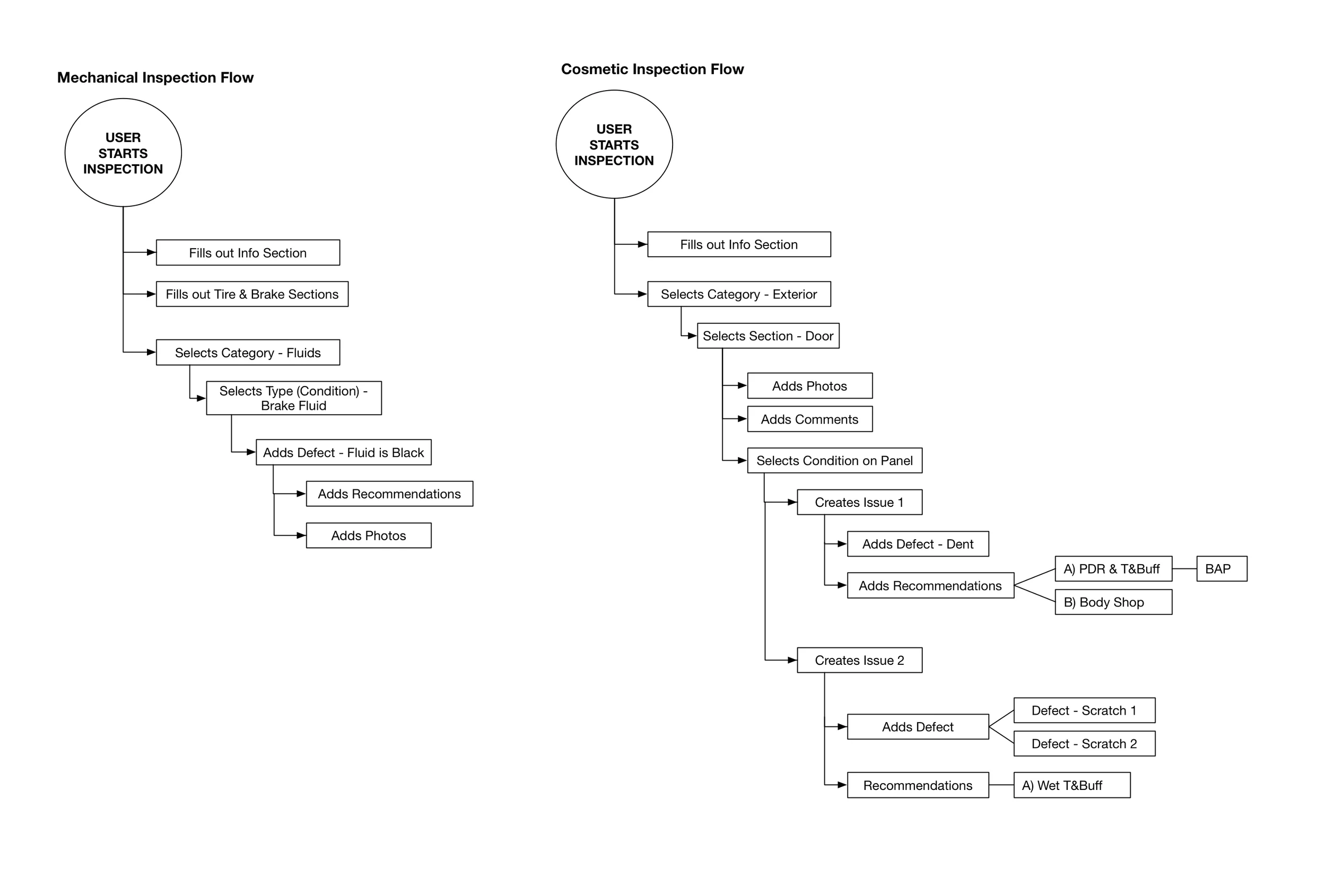
The each inspection had a different look and processes for completion, while we had to allow for the different features needed for those inspections, we were able to provide a standard look based on the informational display form design. Using these rule we created a design that has a similar process in both inspections, but still allowing for the different IA of each inspection type.
Update Forms
As with the other form types, we standardized the look and IA rules to improve readability and familiarity for the user.
Mobile Vendor App
Specifically designed for independent vendors who will be using the system outside of the dealership's hardware and/or outside the Condition HUB network. The app stemmed from the need to have an ultra mobile friendly version that is lighter and catered only to independent vendors' needs as a single point user. By carefully considering a vendor's processes and work flow we created an app where an independent vendor can easily flow through their work process at various locations, manage their billing process , and monitor their business productivity.
Sample of Sections
User Flow Sample - Log In/Create Account


